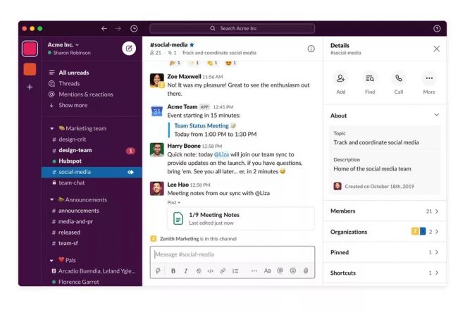
The Slack announced that it will make a major overhaul in its layout, calling it the largest in history and which will bring more impact to users. According to the company, everything will be much simpler and easier to do, because there will be a big change in the sidebar, composition button, navigation bar and other specific adjustments.
“This is the biggest overhaul in Slack history. We took many of the historical features and reorganized them in a way that makes them much more apparent and simple to use. That was the goal of this process,” explains Ethan Eismann, vice president of design Slack, in an interview with The Verge . According to the company, user feedback was important for these changes to be thought and carried out. To do this, Slack created a channel shared between its product managers, engineers, designers and about 100 external “Slack champions” who are Slack administrators or help to implement the application in companies. “They were in one workspace, and we were in another, and we were able to deploy these prototypes in them.
They gave us real-time feedback and also started giving feedback and talking to each other. It was this interactive co-creation process, with immediate feedback “, reveals Eismann. About 30 different companies participated and this allowed Slack to understand the impact of design changes almost immediately. Although most of the changes appear primarily in the desktop and Web versions of Slack, the company is also planning a redesign for its mobile app in the coming weeks.
Side Bar
The new Slack design starts with the sidebar. The biggest change is that all messages, channels and applications now support grouping into sections that can be collapsed on that bar. This means that if you are working on a project that has certain channels and group conversations with direct messages (DM), you can group them all into one useful section and drag it where you want it in the sidebar. Unfortunately, the new sidebar section feature will only be available on paid Slack plans, not free versions.
There is also a new compose button on the sidebar that serves as a universal way to start a message anywhere on Slack. You can start writing a message as a DM or directly on a Slack channel and it will load it into the history of relevant messages in the draft view before clicking send.
Searching for people, channels and reacting to topics and mentions has always been a little tricky on Slack, but that has also improved a lot now. There is a new section in the People, Mentions and Reactions sidebar. Now you’ll be able to quickly see mentions, channel warnings and find people you want to chat with privately. It will also be possible to customize the width of the sidebar and adjust its color with 11 new themes - but this will not be available immediately.
“Slack’s design was more complicated than we really thought,” admits Eismann. “We want to ensure that it is easy for anyone to use Slack. It is important that the program is adaptable to the way people work,” he concludes.

Another novelty that Slack will gain will be an upper navigation bar. According to the company, this tool will help users to make more assertive searches and also switch between channels and private conversations. It will also support keyboard shortcuts or mouse buttons that you would normally use to navigate back to a web browser.
Other Changes
Elsewhere, Slack is also receiving minor changes to the user interface to clear channel detail panels, menus, preferences and even an increase in spacing. All of this should result in a Slack app that looks a little easier to use and is less confusing.
All new changes to the desktop and web versions start to be implemented today, but initially for new users. With the new coronavirus pandemic and the substantial increase in people working from home, the company will use these workers to implement the changes. For older users, the changes should appear in a few weeks.

